Kraftly
See the projectThe app is a platform to sell a variety of craft suppliers for hobbiers and craft businesses. Kraftly makes it easy for crafters to find and order easily craft supplies from their phones. Users can save their orders for the next purchase.
 FigmaAppMarketplace
Role
UX designer
Time
1 month
Team
Self-directed
Year
2021
Deliverables
Mobile app
Lo-fi prototype
Hi-fi prototype
User Testing
Research
According to some interviews that I have conducted, potential users want to have a trustworthy buying experience. They want to see adequate information to decide which product to buy. Especially some of the craft supplies should be touched and felt before buying them to understand the texture or color. They also mentioned that they want to see comments and a scoring system for the products sold to choose the right product to buy.
User stories

Lukas
Lukas is a student who needs to discover various types of papers with different textures and order in a large amount because he organises paper craft workshops and needs paper materials for it.

Marlene
Marlene is a jewellery designer who needs to order well-described craft supplies with quality because she needs specific and unique materials for her creations.
Problem
Adults who run home-based craft businesses or have craft hobbies want to buy craft supplies easily and fast. However, their challenge is to find adequate information about a material, understand the quality of it, and order it easily and securely from a mobile application.
Ideate
Site map

Ideate
Wireframe
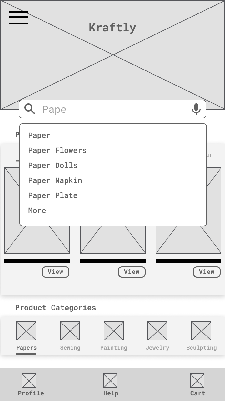
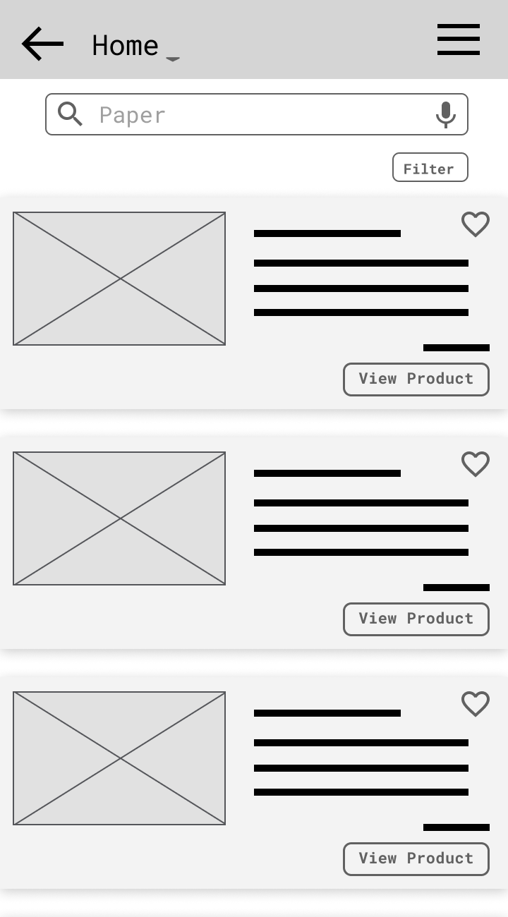
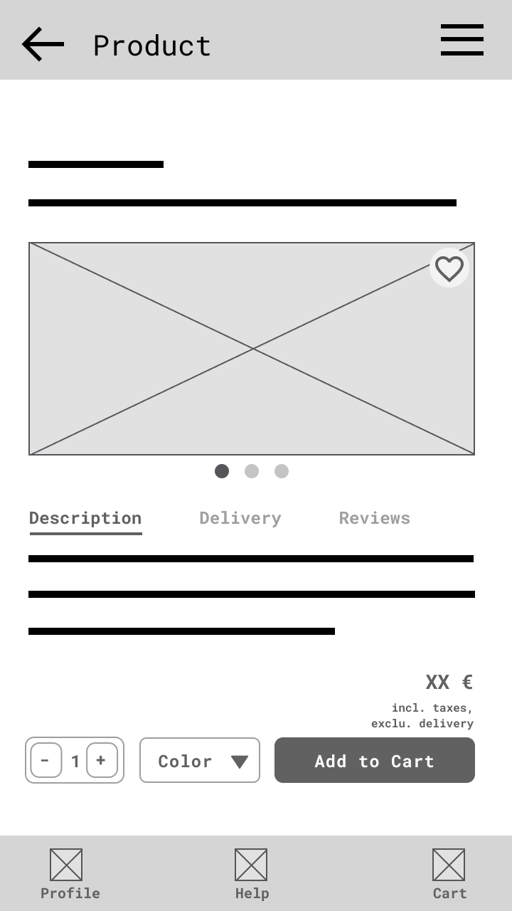
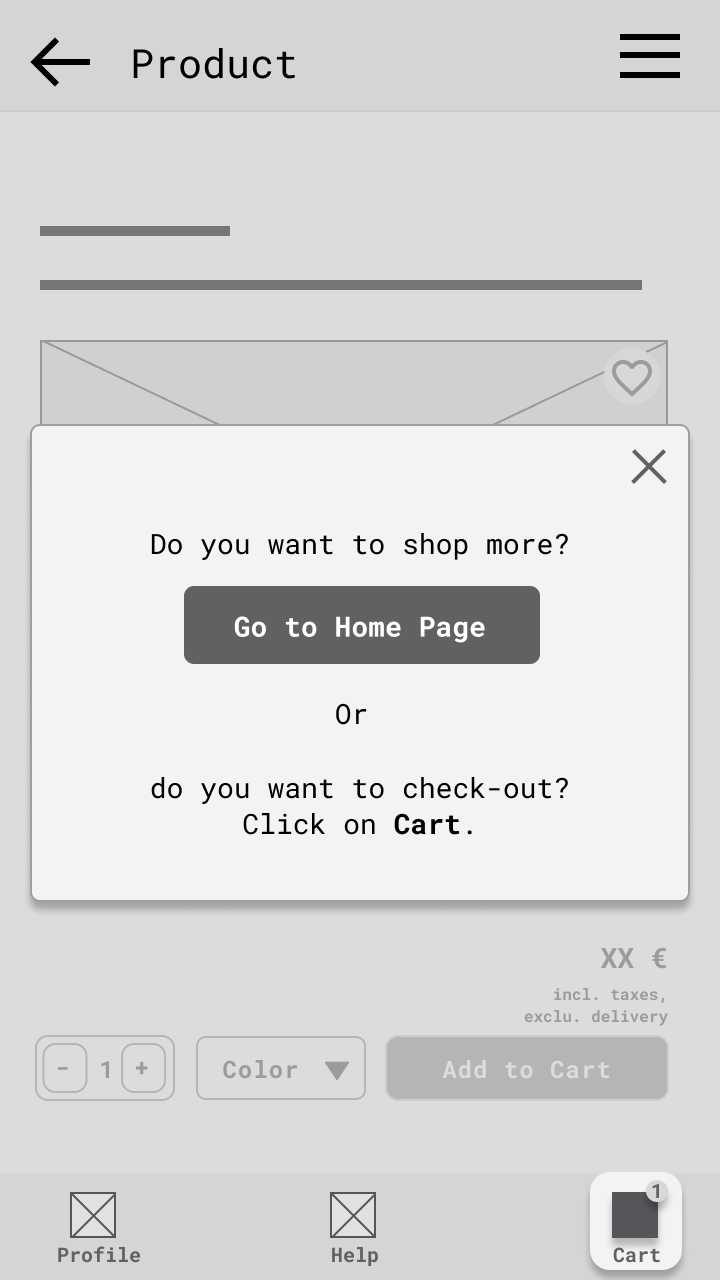
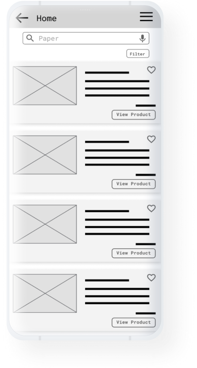
Digital wireframes
Usability testing
The low-fidelity prototype was the tool for usability testing. The aim was to determine if users complete core tasks such as searching a product, adding to the cart, and checking out. In addition, I have tried to determine if this app is difficult to use or not.
Methodology
Moderated usability study
Participants
5 Participants
KPI
Conversion rate System usability scale
Location
Germany, remote
Date
6 Aug 2021
Length
30 min (each)
Usability testing
Key Insights
Task success rate
88%
System usability scale
95%
Visible check-out button
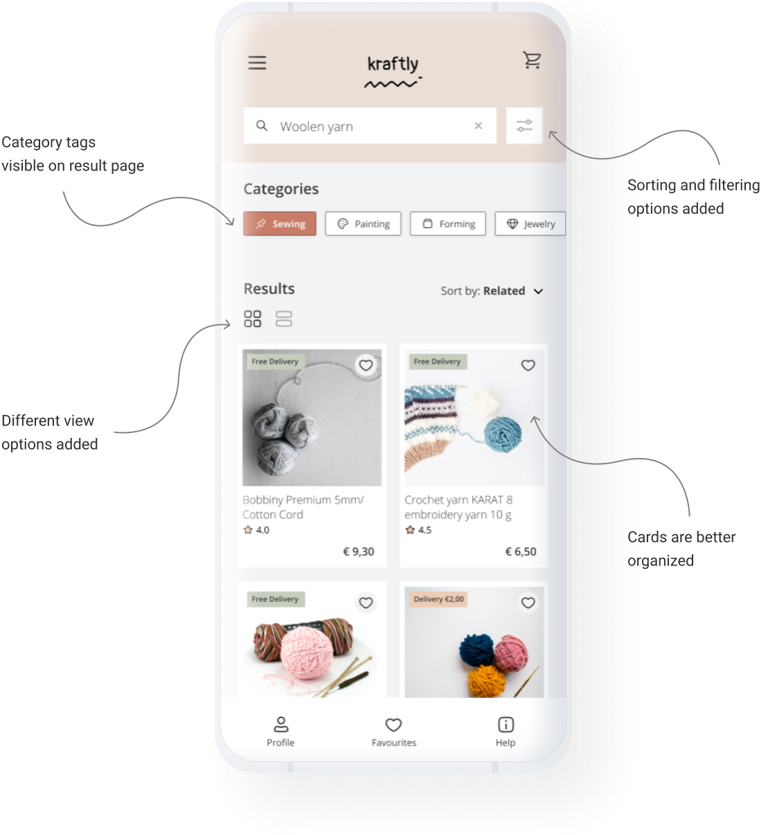
Keywords while typing on search bar
Sorting and filtering options
Product categories at home page

Solution
I have designed an intuitive, easy-to-use mobile e-commerce application where users can easily navigate and follow the steps with clearly labeled buttons. They can find all information and images about the material needed in an organized and calm way. Neutral colors of the application make users focus on the colors and texture of the materials sold. Labels and tags combined with icons are for better navigation and legibility.
Final design
Features: Animated splash screen
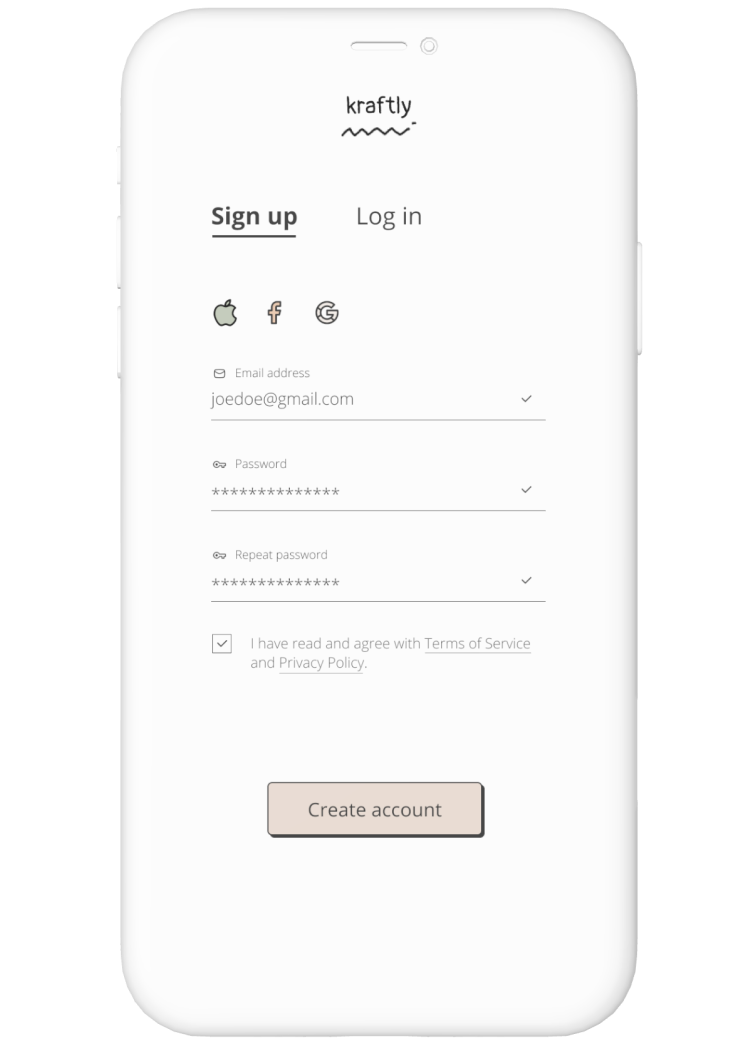
Users are welcomed with an animated, friendly splash screen and land on the sign-up page.
Final design
Features: Hamburger menu
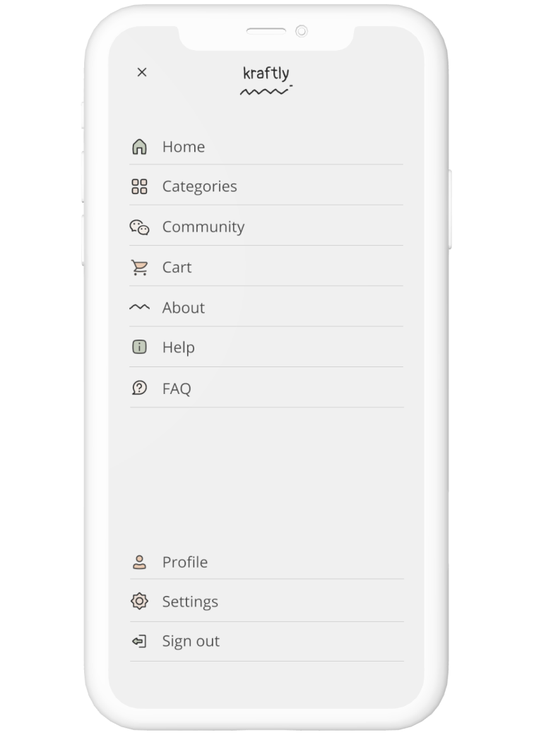
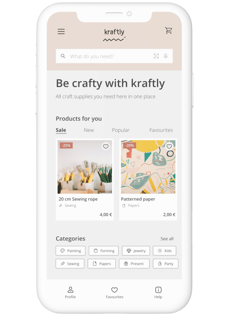
Sub-menus are placed under hamburger menu and designed with related icons.
Final design
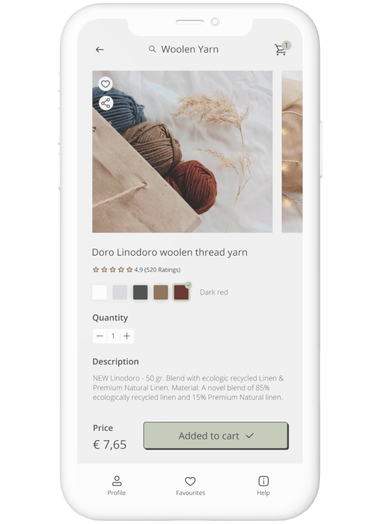
Features: Adding item to cart
Users can review all the important information and customer reviews. They can choose the colour and the amount of the material.
Final design
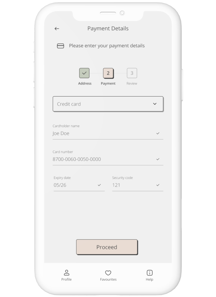
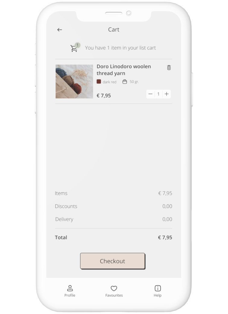
Features: Check-out with clear steps
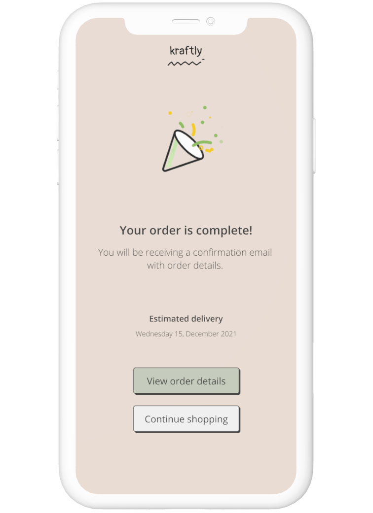
Check-out consists of three steps: entering address information, entering payment information and reviewing the item. The steps are clearly indicated for customers. Upon confirmations, customers get a confirmation page.
